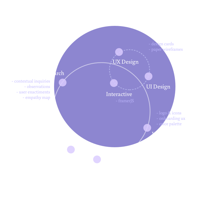
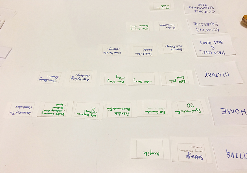
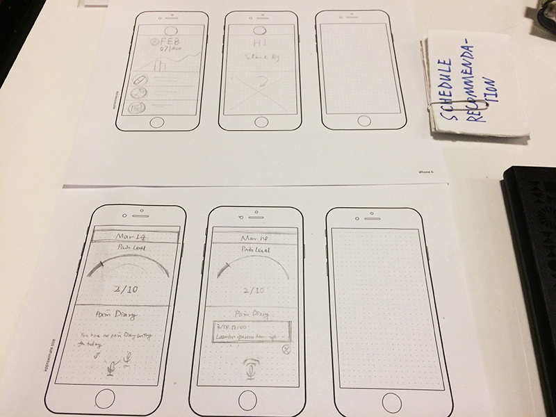
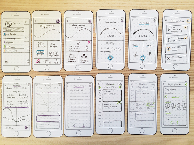
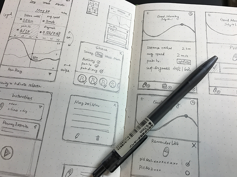
JUST A MOMENT

JourneyOn Mobile

Overview

JourneyOn is a mobile application that provides recovery tracking and life adaptation assistance for users who suffer temporary mobility issues. The design of this mobile app is based on a pervasive interaction design project . While the previous project was meant for a forseable future, this mobile app focuses on the realization of same concept at present, under constraints of our current level of technology.


  • Keywords: mobile application, information architecture, visual design, hi-fi prototyping
  • Primary Tools: Photoshop, Sketch, FramerJS
  • Team: Xinyun Sheng
  • My Role: UX/UI design, visual/identity

  • This is an ongoing project. Please feel free to contact me for information on our current progress.

Problem Space

From our previous research including observation, interviews, empathy map, and user enactments, we identified the following painpoints among temporary disabled crowd:

Transparency of recovery process

Adaptation to new routines

Social pressure

  • Users tend to feel uneasy about the lack of transparency in recovery status. They intend to go back to their "normal" way of life as soon as possible, which oftentimes results in disappointment and stress.
  • People with temporary mobility issues experience difficulty managing time and energy for the daily tasks once natural for them, espeically in earlier stages of recovery.
  • A tension exists between user's self-esteem and their incapability of performinf daily tasks in reality. As a result, users are more likely to feel isolated from social interactions than before having mobility issues, and may find it difficult to ask for assistance due to this mentality.

Our previous project concluded with a final concept, a pervasive system consisting of various orchestrated devices. The system features three main functionalities: Recovery tracking, Recovery exercise, and schedule assistance. Special attention was given to the social and communicational aspect of user's life, as reflected in the social sharing and communication features embedded in certain functions.

Adopting the very concept on a specific mobile device, however, requires a clear focus on the advantages and disadvantages of the device, and to flesh out the application with appropriately detailed information and functionalities. With this challenge in mind, we started with a more detailed analysis of system functionality on mobile platform.

Solution Space

While our previous design concept lies in the orchestration and networking among devices, our focus on the mobile platform requires repositioning and rethink on design's functionality and relationship with other chanels of information. We identified the main functionalities as the following:

Restructuring Functionality

  • Recovery Tracking. The mobile app works as a portable recovery diary book, a one-stop shop where users can see their exercise stats, pain level records, and activity rates. Apart from recording and presenting recovery data, the app is able to analyze user data and provide smart predictions and suggestions, e.g. calculate travel time basing on past activities, suggest recovery exercise program basing on stage of recovery, etc. Recovery tracking and its data serves as an underlying core of the mobile app, keeping its content close to user's need.

  • Exercise Instructions. The app provides timely instructions on daily medication and recovery exercise based on user's stage of recovery as well as suggestions from user's physician.

  • Schedule Assistant. Utilizing user's recovery data, the mobile app is able to estimate user's travel speed and time in their daily activities, and therefore give users smart suggestions on how to reach their destination in time.

We intend to utilize and accentuate the very features a smart phone is both capable and good at doing, such as recording, capture, reminder, and real-time communication. With these affordances and constraints in mind, we were able to keep close to the core of our design concept while adapting to the specific platform.

Utilizing design cards, we filtered out the major blocks of information to be presented in our system and rated these information items by their relevance to each information space they belong to. We followed by visualizing these structured information into wireframes. Meanwhile, we started thinking about a general visual rule behind the wireframed UI elements, which later sets an undertone of the mobile app as a whole.

Information Architecture

A comprehensive and detailed visual design was a new playground for our team. In rounds of explorations in visual patterns, we seek to embody a calm and delightful mood throughout the visual system. The structural logic from the wireframe phase proved to be immensely helpful, yet to create a full-ledged visual system required much attention indeed.

Visual Evolution

After several rounds of brainstorming, we agreed to use a sail boat as a symbol for the "journey" concept. We also explored our logo design, onboarding experience, and icon sets etc.

A Touch on Branding

Prototyping

Using FramerJS, we are currently developing an interactive prototype that demonstrates the three main functionalities included in our design. This is an effort both to present our concept to others, and to inspire more natural and intuitive interactions that may enhance overall user experience.

The development of our hi-fi prototype is still in progress, so we only have a few key interactions presented in the demo below (viewing history activity data and pain diaries). You can find the clickable demo uploaded here. For more information, please feel free to contact me for latest progress of this project should you be interested.